Neda. N
2025
UI/UX Design
UX Research
Mobile App
Improving Shared Expense Management to Better Support Splitwise Users’ Needs
Introduced Admin Roles, Proxy Payers, Auto Reminder, and Multi-Currency support to make expense management effortless and transparent.
Introduction

Splitwise, A Diamond Built on Trust.

Splitwise is a popular app for easily splitting expenses among friends and groups. At its core, it values friendship and fairness, making sure no one feels awkward about money, even its diamond-shaped design subtly reminds users that true friendships, like diamonds, are precious and worth keeping clear.
Can Splitwise really preserve the friendships it promises to protect? Let’s find out.

I contributed to the overall design process for conducting user research, synthesizing insights, and designing the end-to-end experience, from wireframes to final high-fidelity prototypes. I also created user flows, dashboards, and usability test plans to refine the overall experience.
My Role
Team: 2 UX/UI Designers
Mentor: Marzie Nadali
Duration: 4 Weeks
Tools: Figma · FigJam · Adobe Illustrator Adobe Photoshop · Trello ·
Project Scope
What is the problem?
Splitwise users face challenges in managing large groups, such as tracking individual contributions, splitting specific bills, or resolving disputes, impacting its usability for shared expenses.
As groups get larger, keeping track of who paid, what’s still pending, and managing disputes can get confusing. This project aims to simplify expense management and increase trust and transparency.
.png)


Splitwise current design!
What are we aiming to achieve in our design?

.png)
To Simplify Group Expense Management by improving Splitwise’s flexibility and clarity, ensuring users can track, split, and settle expenses effortlessly, with less confusion and more confidence.
This project’s design goal is to make Splitwise a tool that supports both fairness and friendship through clarity.
But first, lets Explore
the App Through a Critical Lens...
-
Competitive Analysis
-
Usability Testing
-
Interviews
-
User Persona
-
Journey Map
-
Ideation
-
Admin Role
-
Proxy Payer
-
Auto Reminder
-
Multi-Currency
Through our heuristic evaluation, we discovered that two principles were most critical to Splitwise’s experience , Error Prevention and Visibility of System Status.
We conducted a heuristic evaluation of Splitwise using Nielsen’s 10 usability heuristics to uncover friction points in managing large group expenses. While the app succeeds in promoting fairness and simplicity, our evaluation revealed key areas where users lose clarity — particularly in tracking payments, understanding balances, and managing reminders. These insights guided our redesign toward a more transparent and effortless group experience.
Desk Research
How Users Feel About Splitwise?
Across forums and app stores, users were vocal about what works—and what doesn’t. While many praised Splitwise for making shared expenses easier, others revealed where friendships start to feel the strain: confusing settlements, hidden debts, and the emotional awkwardness of “who owes whom.”


%203.png)
Rigid tools for
flexible groups.
Reminder functionality
lacks flexibility and control.
Hard to understand how costs are divided.
Unequal splits are confusing and time-consuming.
Competitive Analysis
Research Highlights the Need for Clear Roles, Transparency, and Smart Automation in Splitwise.
We evaluated Splitwise’s competitors to see how they handle group expense challenges. We focused on clarity, trust-building, multi-currency management, and ease-of-use features to uncover opportunities for improving Splitwise’s experience.

Settle Up
Venmo
Tricount

Observation:
Observation:
Observation:
Automatically sends in-app reminders, reducing the embarrassment of manually requesting payments.
Provides upfront guidance on how expenses are split, giving users clarity and minimizing confusion within groups.
Organizes expense entry into clear categories and fields, ensuring a structured and user-friendly experience.
Usability Testing& Interviews
Conversations That Informed Our Design Decisions.
We conducted 7 interviews with existing Splitwise users who had experience in large groups, and 5 usability tests with new users who had never used Splitwise before. The goal was to uncover how experienced users handle complexity in group expenses and to observe how first-time users navigate core tasks.
“Even if I’m not sure the amounts are right, I don’t say anything. I’d rather keep things calm than argue about money.”
"Finding and paying off debts was really difficult; the app felt like a puzzle.."
“When I travel, Splitwise shows debts in different currencies, so I have to calculate the total myself.”
“Anyone in the group can edit expenses, so it doesn’t always feel trustworthy.”
Insights
What We Learned from Users?
Users value transparency and fairness in shared expenses but seek more comfort and clarity in the process. Managing money with friends is about trust and reducing tension—they want a system that feels fair, friendly, and effortless.
User conversations exposed friction between fairness,
transparency, and maintaining friendships.

User Persona
Walking in User’s Shoes...

Journey Map
We studied user paths to learn what flows smoothly, what breaks down, and where we can make a difference.
.png)
.png)
Ideations
How Can We Identify Ideas That Are Impactful and Feasible?
We used an Effort-Impact matrix to evaluate and prioritize our ideas. This helped us pinpoint features that would be both high-impact and feasible to implement. Among the selected ideas were features like multi-currency support, an expense breakdown view, a personal financial dashboard, a proxy payer mode, ‘Settle All’ options, duplicate expense detection and merging, auto-reminders, and a group admin role. By mapping these ideas, we could clearly see which solutions would deliver the most value with reasonable effort.

UI Design
From Concepts to Design: Bringing Ideas to Life.

Our redesign transforms raw ideas into seamless, user-centered interfaces. By refining navigation, simplifying key actions, and aligning with real group behaviors, we reduce friction and enhance the experience of managing shared expenses. Through unified dashboards, smart roles like admin and proxy payer, and clearer financial overviews, our UI brings structure to complexity—turning everyday tasks into effortless interactions.
High-Level Personal Dashboard
Problem
Users lack a clear, visual way to track group finances. They must navigate multiple lists to see who owes, who’s paid, and what’s pending, causing confusion and inefficiency, especially in large groups.
Solution
We designed two dashboards to simplify group finances.The Admin Dashboard shows total balances and pending approvals, while the Member Dashboard provides a clear view of balances, reminders, and notifications at a glance.
A quick snapshot
of the total balance across all groups.
A single button to settle all unpaid balances at once.
A list of transactions waiting for admin review, where the admin can approve or reject each.
Highlights the groups with the most activity based on recent transactions.
A visual overview of spending categories across all groups.
A short summary of recent transactions and updates within the groups.
Admin Dashboard
Member Dashboard
Shows how many groups the member is currently part of.
Displays alerts such as rejected or approved expenses.
Shows any pending payment reminders for people the member still owes.
_edited_edite.png)

Group Admin Control
Problem
Currently, Splitwise lacks a defined group admin role, leading to confusion and potential conflicts over expenses and balances. Without an admin to review and approve transactions, accountability and clarity within groups are limited.
Solution
We introduced a Group Admin role to enhance clarity and control within groups. The admin can review all newly added expenses and either approve or reject them from the Pending section. This ensures accuracy, prevents duplicate or incorrect entries, and builds trust and accountability among group members.
Groups

Each group is assigned an admin to manage expenses.
Vegas Trip Group

Each group’s main page shows the assigned admin and their key information.
Admin Dshboard
_edited.png)
Each expense now has a pending approval status, allowing the admin to review and confirm.
Smart Auto Payments Reminder
Problem
Reminders are sent manually by users, often outside the app. This creates awkward social situations and can strain friendships, as people feel uncomfortable reminding others to pay. Users prefer an automated system that handles payment reminders politely and effortlessly.
Solution
We replaced manual reminders with automatic reminders that users can customize in the Reminder Settings. They can choose when reminders are sent after no payment (e.g., after 7 or 10 days). In the Pro version, a Smart Suggestion feature recommends the ideal reminder timing based on the user’s payment history.
Before
Account - No Reminder

No dedicated section for reminders or reminder settings exists in the current app.
Reminder Settings

Users send reminders manually, often outside the app—making them feel awkward and sometimes straining friendships.
After
Account - Reminder Added

Introducing Auto Reminders in the Account → Reminder settings.
Reminder Settings
_edited.png)
They can set a custom frequency (e.g., 3 days, 7 days, 10 days).
Users can toggle Auto Reminders on/off.
Suggests the best reminder timing based on the user’s payment history.
Member Dashboard

All pending reminders also appear directly on the Dashboard for quick visibility and easy access.
Real-Time Multi-Currency Sync
Problem
Splitwise lacks multi-currency support, creating difficulties for international users who share expenses in different currencies. Members must manually convert amounts or use third-party apps, leading to errors, confusion, and unfair balances. This reduces accuracy and trust in managing shared expenses.
Solution
The enhanced UI adds real-time multi-currency conversion to the expense entry screen. When users enter an amount in another currency, Splitwise instantly converts it to the group’s default currency using live exchange rates. This update simplifies expense sharing, improves accuracy, and makes Splitwise more convenient for international users.
Before
Add an expense - No Multi-Currency
_edited_edited_ed.png)
No dedicated section exists for the real-time multi-currency conversion feature.
Group Page - No Multi-Currency

No dedicated section for the real-time multi-currency conversion feature on the group page.
After

Users can add an expense, choose their preferred currency, and instantly view the real-time conversion in a secondary currency.
_edited_edited.png)
View expenses in base and converted currencies for international trips.
Proxy Payer
Problem
Not everyone in a group feels confident handling payments, some are new, unfamiliar with finance apps, or prefer to stay hands-off and let a trusted friend manage expenses. Since Splitwise didn’t previously support this kind of arrangement, it often led to confusion about who actually paid, creating messy balances and unclear records in larger groups.
Vegas Trip Group

Add “Assign Proxy” option in group page so members can formally nominate someone.
Add a “Join via QR Code” option so members can quickly scan and join a group without searching or manual invites.
Proxy assigned confirmation
Both users receive confirmation messages to keep transparency and avoid misunderstandings.

Group balance with proxy
Replace the reminder button with “Settle up via proxy” so members can assign a proxy later if they missed the first step. This keeps proxy payments simple and visible in balances.
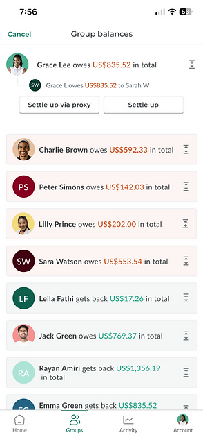
Solution
The new “Proxy Payer” feature makes shared payments more inclusive and transparent by letting members assign someone else to pay on their behalf. Both users receive confirmation, and the proxy’s payments automatically appear in the group balance, creating a smoother and more trustworthy experience.
Choosing Proxy payer

Show group members with quick-select options and a clear “Assign Proxy” button.
Proxy payer confirmation

Notify the proxy with a Confirm / Decline option so they stay in control.
Record a payment via proxy

Show who is paying on behalf of whom to keep records clear and avoid mistakes.
Breakdown Pop Up
Problem
Users found it difficult to understand why they owed a certain amount. The expense details were scattered across different sections, making it hard to trace how totals were calculated or who paid for what. This lack of clarity caused confusion and reduced trust in the app’s balance accuracy.
Solution
We introduced a Breakdown popup accessible via a small chevron icon next to each expense. The popup clearly explains the total amount, how it was split, who paid for it, and the user’s share. This design improves transparency, helps users easily understand their balances, and reduces cognitive load during review.
Member Dashboard
Breakdown Pop Up
_edited.png)
_edited.png)
We introduced a small calculator icon next to each expense.
A breakdown popup opens, that clearly explains why the user owes a certain amount. The popup shows itemized details such as the total cost, how it was split among the group, who paid for it, and the user’s share.
Duplicate Expense Detection
Problem
When multiple users add the same expense (like the same dinner bill), it creates confusion and double-counting. Manually finding and fixing these duplicates is time-consuming.
Solution
We designed an automatic duplicate detection system to keep group expenses clean and accurate. When a similar expense is added, a smart pop-up appears with the matching details, allowing users to merge it with the existing entry or add it anyway
Duplicate Detection Pop-up
_edited.png)
When a duplicate is found, the app shows a clear alert with the matching expense details. Users can then choose to merge with existing or add anyway.
Impacts From User Feedbacks
User Feedback Highlights the Power of Clarity and Role Definition in Building Financial Trust.
Since we didn’t have real usage data, we focused on what users said and how they felt during testing. Our users’ feedback showed us exactly what mattered most: giving them a clearer sense of who can do what, and making the process of managing group expenses more transparent and stress-free.
If this redesign were implemented, we would measure success by how confidently users handle shared expenses and how smoothly they adopt these new tools.

What we learned
Learning from challenges and collaboration
Balancing Emotion and Strategy
Designing for users means understanding both their feelings and their goals. I learned how trust, fairness, and small emotional cues can shape financial behaviors as much as functionality does. Every decision should speak to both the heart and the logic of the user.
Turning Collaboration into Clarity
Working closely with my teammate taught me the value of open discussion and feedback loops. When ideas are challenged and refined together, even the most complex problems can transform into clear, human-centered solutions.
Designing Beyond Usability
True design impact goes beyond fixing usability issues. I learned that every interaction is an opportunity to build empathy, preserve relationships, and make people feel understood, pixel by pixel.
Next steps...
Learning from challenges and collaboration
The next phase will focus on usability testing and collecting real user feedback to validate our assumptions. Future iterations could explore advanced features such as AI-powered spending insights, improved multi-currency support, and integration with payment platforms to streamline settlements.
These steps will help transform this concept project into a more realistic, scalable solution ready for real-world users.